I’m a big fan of urban spaces and buildings, but if not done well, these high-rises can be all the emotional bummer that NIMBYs claim. New York Magazine describes the recent research documenting this effect:
A growing body of research in cognitive science illuminates the physical and mental toll bland cityscapes exact on residents. Generally, these researchers argue that humans are healthier when they live among variety — a cacophony of bars, bodegas, and independent shops — or work in well-designed, unique spaces, rather than unattractive, generic ones. In their book, Cognitive Architecture: Designing for How We Respond to the Built Environment, Tufts urban policy professor Justin Hollander and architect Ann Sussman review scientific data to help architects and urban planners understand how, exactly, we respond to our built surroundings. People, they argue, function best in intricate settings and crave variety, not “big, blank, boxybuildings.”
The bottom line is that design is critical when it comes to infill and urban spaces. So basically the 1970s were a waste, given how ugly and boxy so many of the buildings from that era are. I think this research also argues against mega-developments on super blocks. Smaller, broken up styles and innovation are more likely to produce interesting and pleasing neighborhoods.
But while it’s easy to bash the 1970s, I see a lot of the same mistakes being made nowadays with infill. Superblock development seems to be more and more common in urban areas, while the latest design fads indicate a return to boxy. Fortunately, places like San Francisco and downtown Los Angeles are building a lot of what I consider to be elegant and sleek glass-windowed skyscrapers. But mid-sized cities like Santa Monica and Berkeley are relying more on the wood frame boxy look.
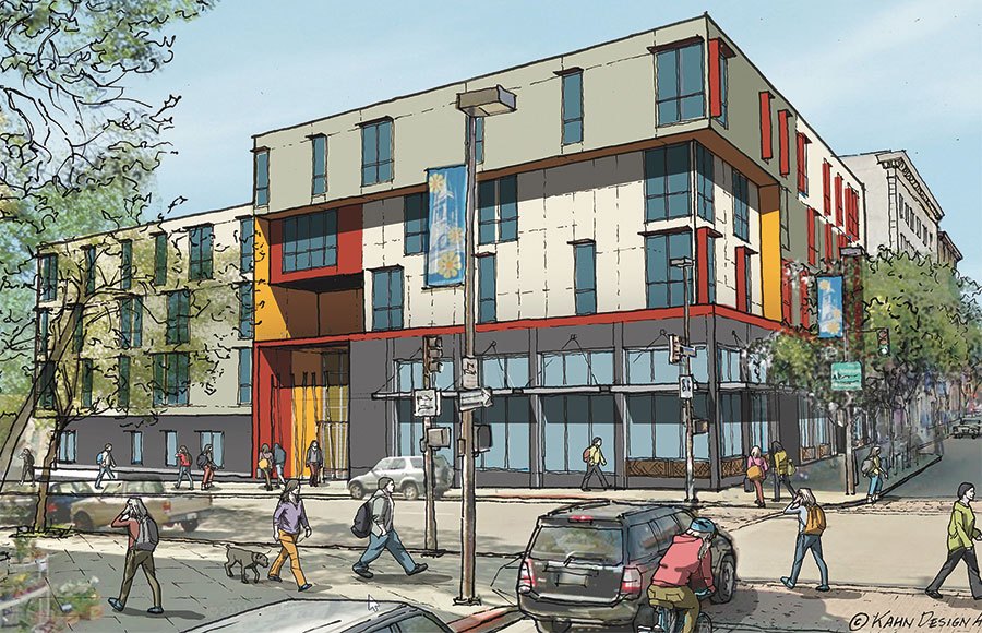
Case in point, on Telegraph Avenue near where I work, a new mixed-use development is popping up on the site of the old Raleigh’s bar that burned down a few years ago. But the look is boxaholic, creating a stark contrast with some of the more interesting and pretty brick buildings nearby that were built early last century, with all their detail and interesting features. Here’s an artist rendering of the Telegraph building (which is almost complete now):
Aside from the use of colors and indented floors, this looks like a larger version of what UPS might deliver to your doorstep.
I’m not an architectural expert, but most of us know good design when we see it. And for those like me who want to see more urban spaces in California, it’s critical that we design them well.
Otherwise, the result may actually be depressing.
Leave a Reply
You must be logged in to post a comment.


