Reaction to the station area grades that Berkeley Law and Next 10 released this week has been mixed, with some transit leaders celebrating good scores and others reacting defensively. Part of the problem is that the media played up the overall transit system average grades, which weren’t great, and didn’t emphasize (or comprehend) that the grades were about the 1/2 mile station areas — not the stations themselves.
Over at the Los Angeles Metro, blogger Steve Hymon raised some interesting questions about the grades for Metro:
I think the results are certainly interesting although not terribly surprising — visiting any of the stations in person gives you a fairly good idea how they’re performing. And let’s face it: tossing 11 factors into a blender to come up with a letter grade only gets you so far: the Gold Line’s Chinatown Station on the edge of downtown L.A. gets an A, but the 7th/Metro Station in the heart of DTLA gets an A-. The Gold Line’s Mariachi Plaza gets an A (perhaps because there is a big employer, a hospital, nearby) but the Gold Line’s South Pasadena Station gets a C-.
The South Pasadena Station is busy and has helped revitalize Mission Street. As I’ve noted in the past, it hasn’t attracted a ton of residential development, although the number of parcels available nearby are limited. The area around the station is largely residential and I don’t think anyone wants or expects serious commercial development nearby. Parking is limited. To my eye, the the station has been very successful — but gets dinged here, presumably, because it’s not near a ton of jobs.
His comments are worth a closer look. First, the Chinatown station versus 7th & Metro. Steve is right that at first glance, the results seem odd. Chinatown gets an A but 7th & Metro gets an A-, even though it’s in the heart of the rail system as a bustling station.
So I checked the breakdown, and the scores were close. Ultimately Chinatown scored better on key metrics like affordability, safety, and transit dependency (number of zero vehicle households in the 1/2 mile radius). But the other factor is that the Chinatown station was competing against other station areas in the “mixed” category (mixed between employment and residential), whereas 7th & Metro was competing in the much tougher “employment” category. Stations in that category tend to be in high-density downtowns like San Francisco, so it’s more difficult to get a good grade. 7the & Metro came close to an A though and still finished in the top quartile statewide.
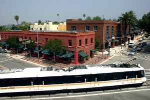
Second, I agree with Steve that the South Pasadena/Mission station on the Gold Line is a great station (photo above). It’s probably the prettiest and most well-designed in the system. So why did it get such a low score, with a C-?
The issue is not, as Steve suggests, about a lack of jobs or commercial development nearby. Instead, in looking at the data, the station area scored low because it was at the bottom for the percentage of people (workers and residents) within 1/2 mile who actually use transit. It also scored low for affordability in the area and for the percentage of people who don’t own a car. Otherwise, it scored well on transit quality, safety and walkability, among a few others.
So if South Pasadena leaders want to boost the Mission station score, they need to encourage people in the area to ride transit more. Certainly building more affordable housing nearby would help, as lower-income people tend to ride transit more often. And presumably the station will benefit from the opening of new lines like the Regional Connector and Expo, which might encourage more locals to ride transit to access more destinations.
But overall, the data reveal that the station area is not that competitive with other rail stations in its place type around the state. They also show that just building a few nice projects nearby is not enough to create a thriving, truly transit-oriented neighborhood. The neighborhood may be thriving, but not many people actually use transit.
Perhaps this station and others like it along the Gold Line, such as Del Mar, will benefit from a newer version of the report card. The 2010 census, on which much of the ridership data was based, does not capture the opening of new lines like Expo and the Gold Line eastside extension, and it doesn’t capture new transit riders moving into the neighborhood in the past few years.
But the data do not lie, and local leaders should explore ways to encourage more transit ridership in that station area if they want a better score in the future.
Leave a Reply
You must be logged in to post a comment.


